Pop-Art Portrait Style Guide
Bold outlines, punchy colours and comic-book energy. Discover what makes a pop-art portrait pop and which photos suit it best.
5 min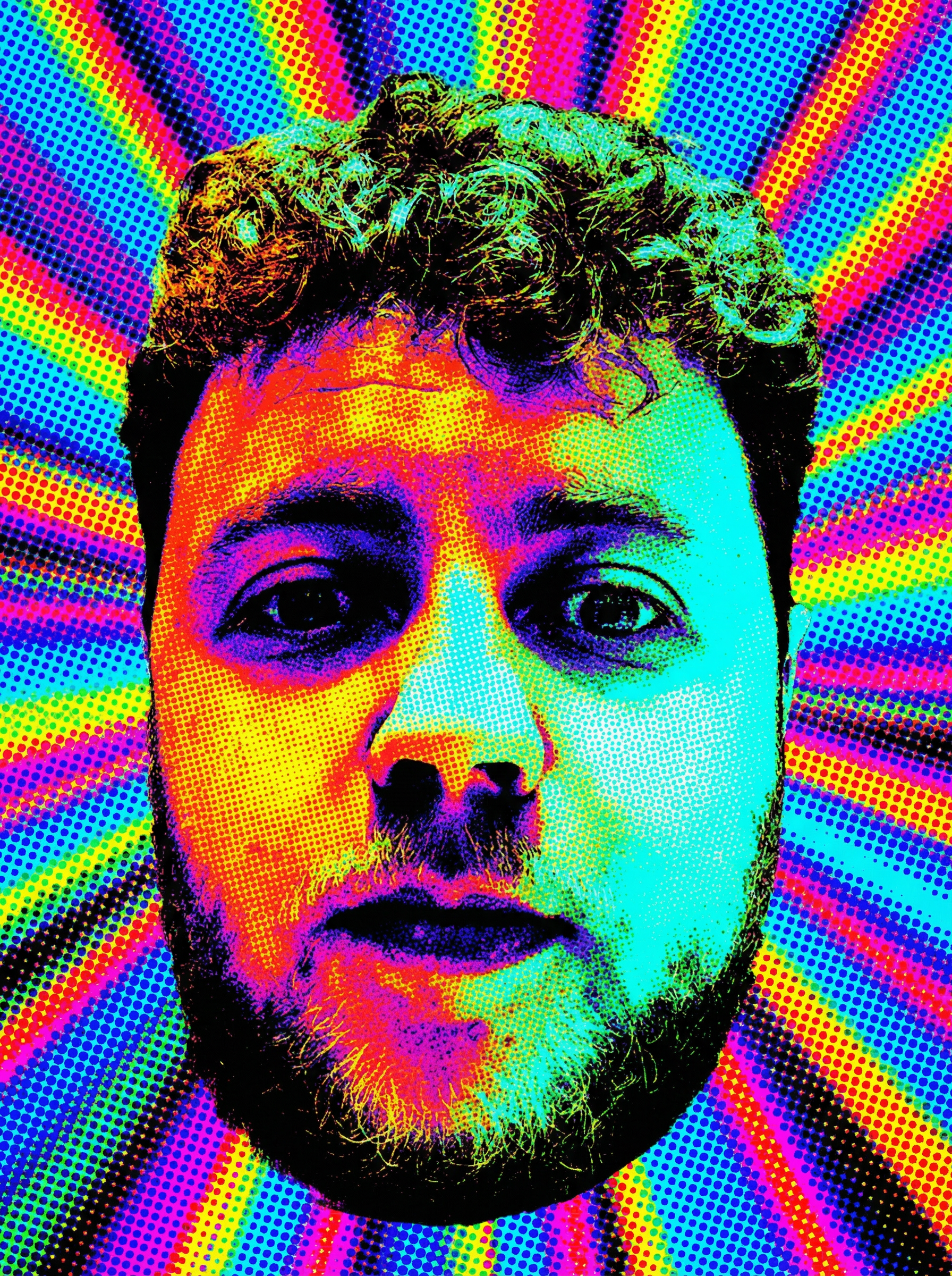
What defines the pop-art look
Pop art turns a photo into a graphic celebration: thick black outlines, flat blocks of saturated colour and playful halftone dots inspired by 1960s comics and screen prints. It is loud, joyful and impossible to ignore.
The style flattens shadows and boosts contrast, so a face reads as clean shapes and bold colour rather than soft gradients.
The best photos for pop art
Because pop art thrives on contrast, choose a well-lit photo with a clear face and a confident expression. A slight smile or a strong gaze translates brilliantly into the graphic treatment.
Avoid dim or heavily shadowed shots; they muddy the bold blocks of colour that make the style sing.
Who loves a pop-art portrait
It is a favourite for bold personalities, best friends and anyone with a colourful home. Pop art also makes a fun, high-energy gift that stands out on a gallery wall or in a bright kitchen.
Styling and displaying it
Pop art loves a simple frame that lets the colour lead: black, white or thin metal. Hang it where the room needs a lift, and consider a set of two or three for a striking comic-strip effect.
Create your personalized poster — free preview in 2 minutes
Get startedFAQ
Does pop art work for couples or pets?
Absolutely. Couples look great in a two-panel treatment, and pets suit a playful pop-art pet version that celebrates their personality.
Will my face still be recognisable?
Yes. The style stylises colour and outlines but keeps your key features intact, so it clearly looks like you.